Refined Focus. Sharpened Impact. This is KeepEdgy Marketing.
We’re refining our focus and sharpening our impact within the architectural, engineering, and construction (AEC) industry. This is a first look at KeepEdgy Marketing—a strategic practice within the KeepEdgy & Co. brand.
Purpose-built for the built environment, this industry-focused practice remains rooted in performance and impact. While our mission to revolutionize marketing in AEC remains constant, our visual identity reflects how we think, create, and lead within the industry.
More than a refresh, this evolution is a refined expression of who we are—and who we’re building for.
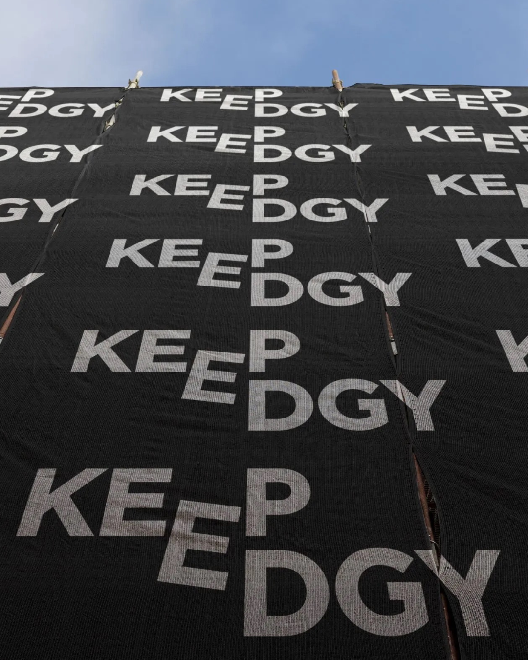
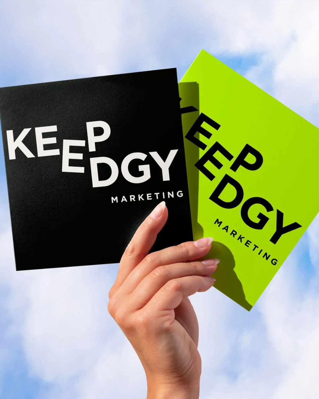
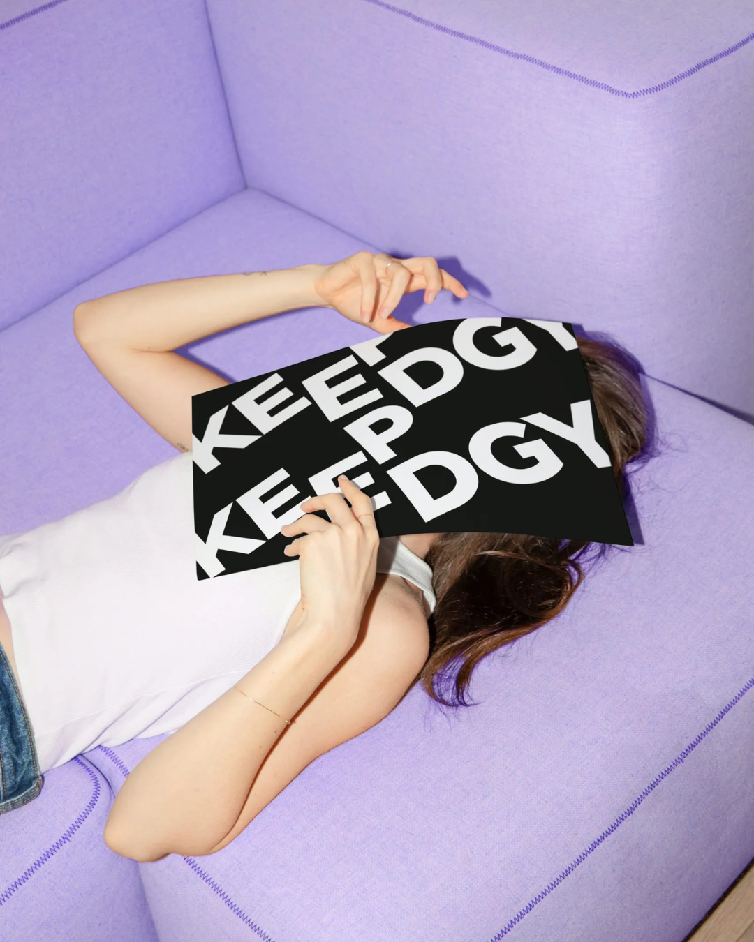
As we kick off 2026, we’re introducing this next chapter with a limited-edition mark from the brand’s refreshed visual identity. Designed for special, non-standard applications, this logo treatment offers a bold reinterpretation of the brand—playfully merging letterforms while maintaining a clean, modern aesthetic that captures KeepEdgy’s confident, edgy character.
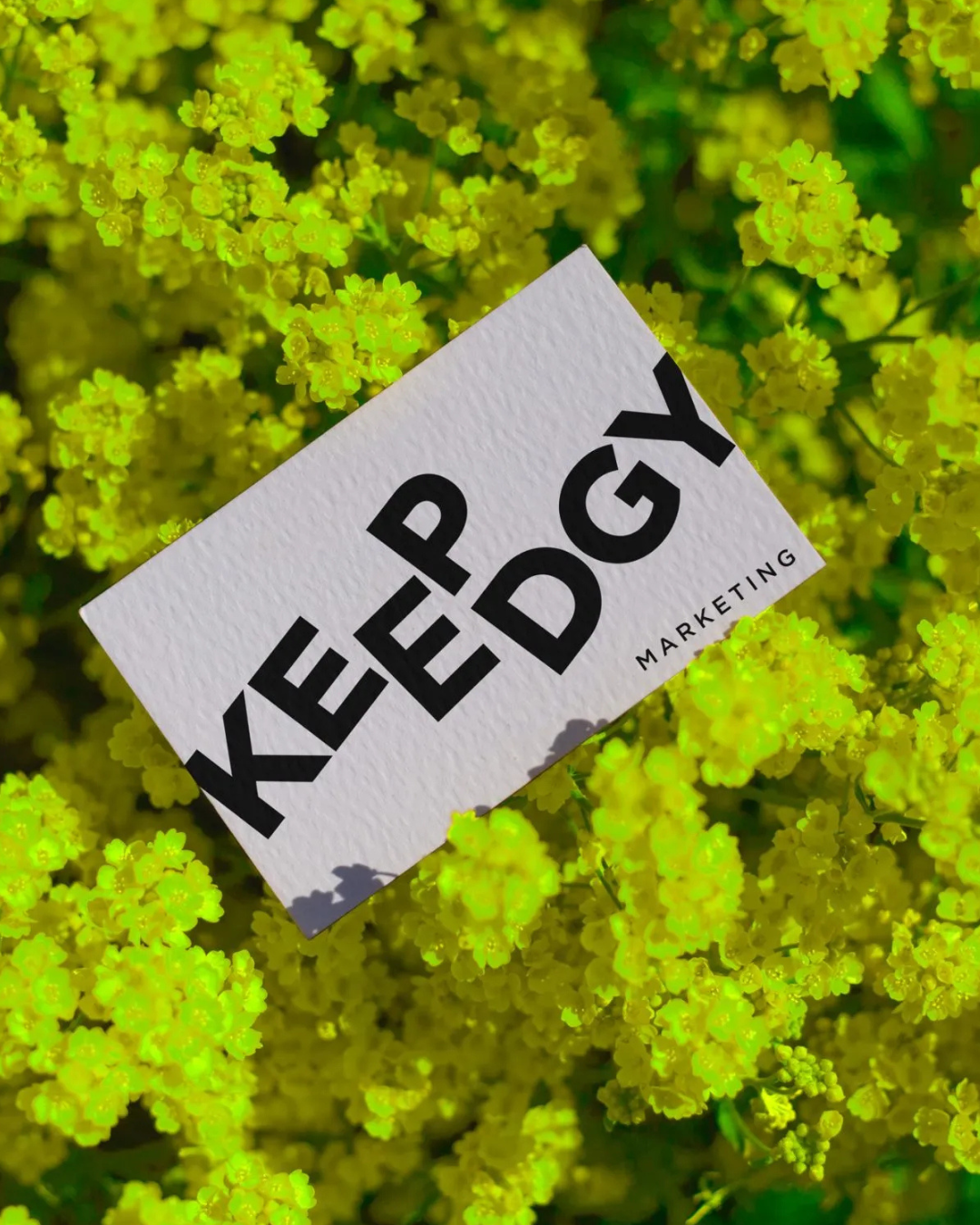
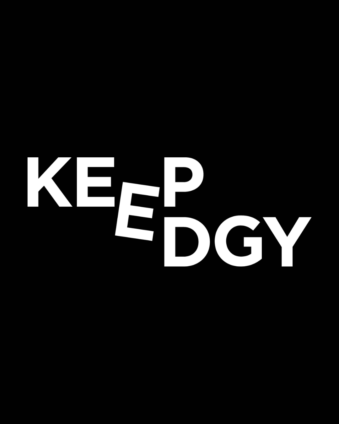
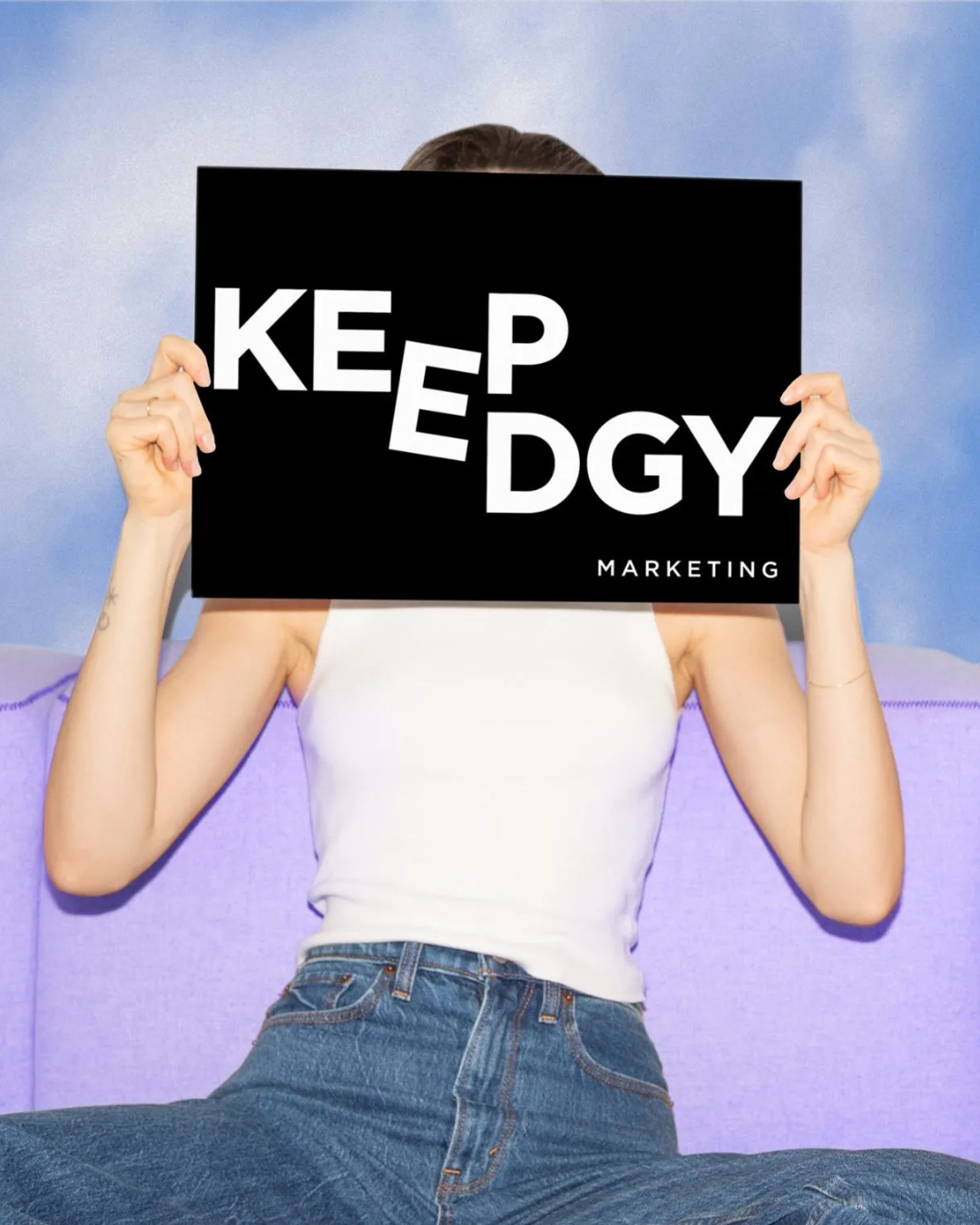
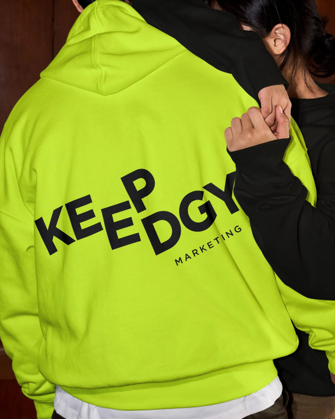
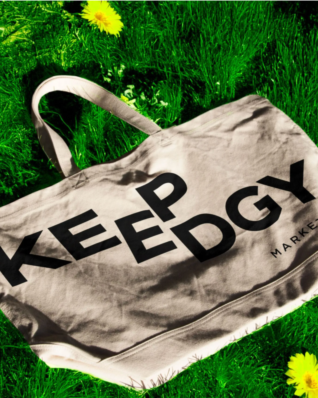
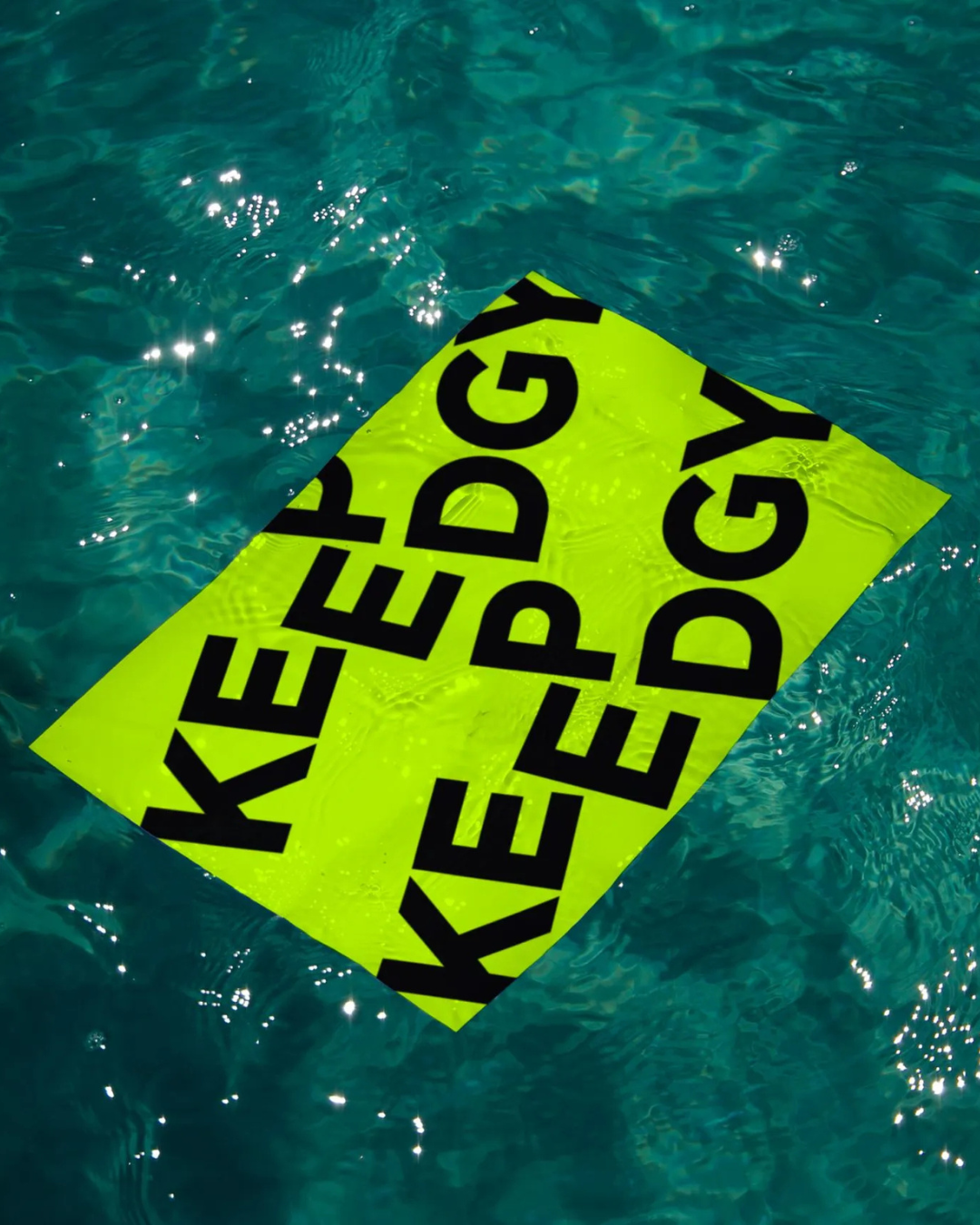
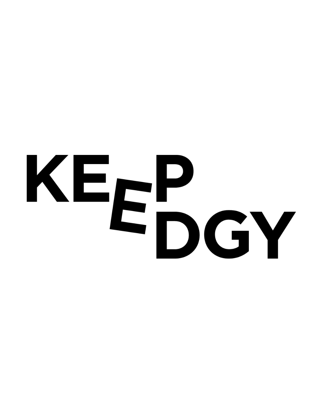
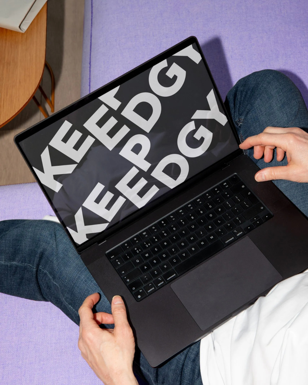
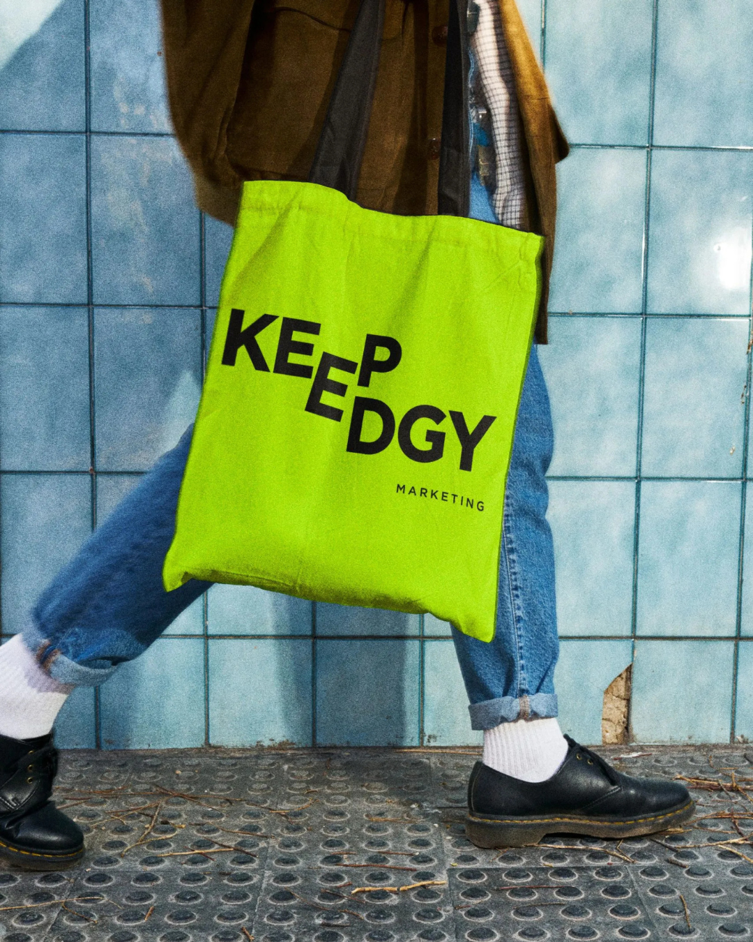
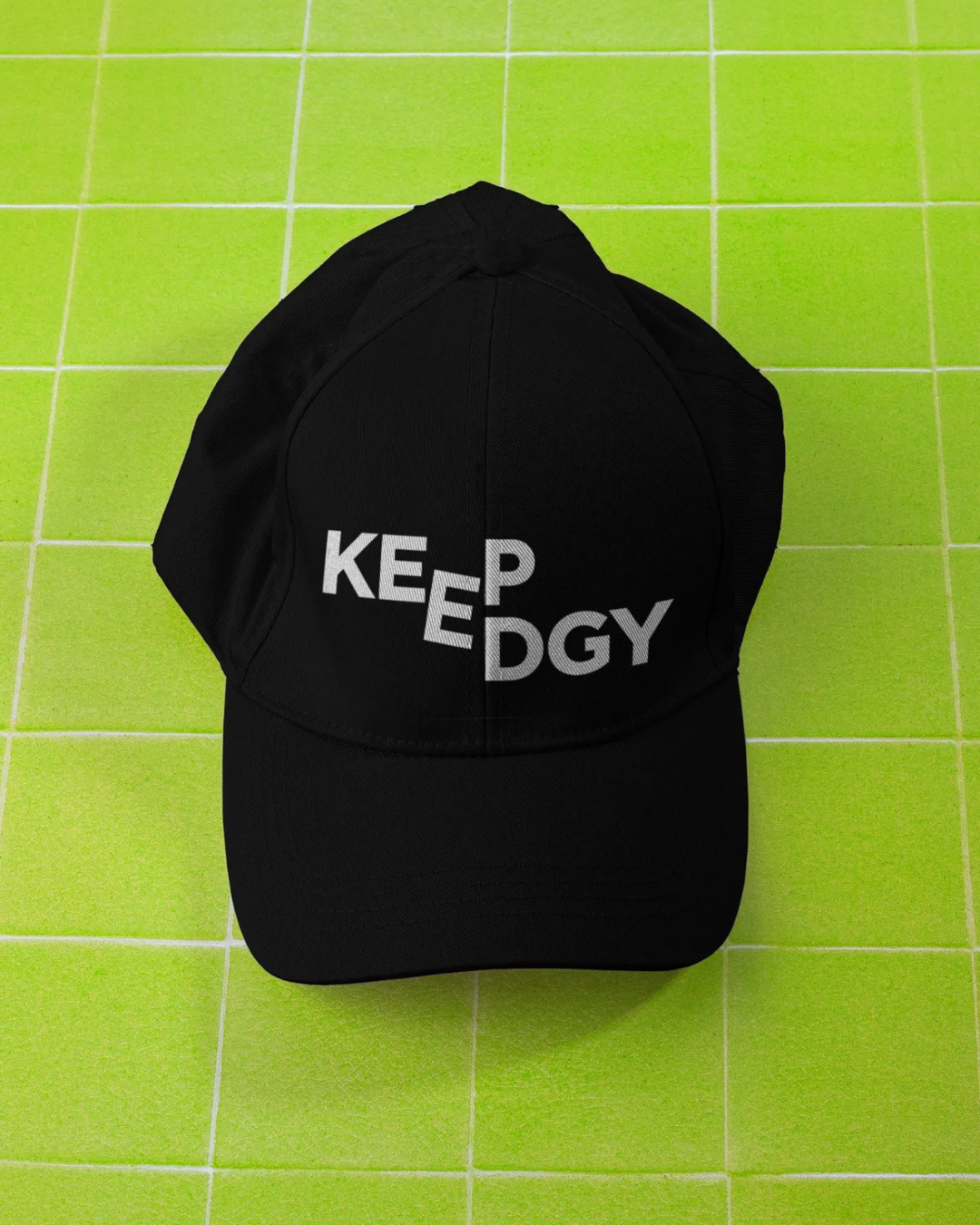
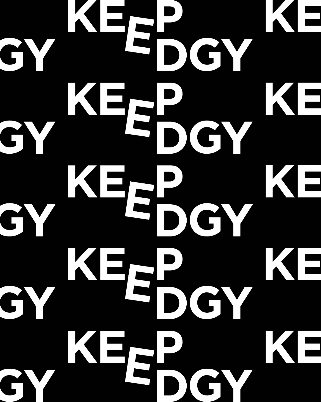
Our primary typeface, Gotham, grounds the brand with structure and precision, nodding to the founder’s roots while reinforcing the balance between creativity and discipline that defines our approach.
Designed by Graphic Designer, Liz Kerkhoff, we’re excited to unveil the next evolution of our brand. Stay tuned as we continue to reveal more of KeepEdgy Marketing’s evolving visual system.